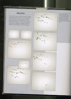
 These scanned images from the book are the ideas for the graphics that appeal to me. The posts following on are of font ideas and text arrangement ideas.
The picture made up of red and white dots is quite similar to cliched microscope images, thus fitting with a possible evolution theme.


 The images containing small black letters floating on a cloudy background I particularly like as it has rather relaxed dreamy qualities, yet at the same time it remains a little academic and serious.
 The images with the red backgrounds and military silhouettes have a rather nice scratchy feel to them.

No comments:
Post a Comment